By Sublime 360 Media Editorial Team · Updated 2026-10-02
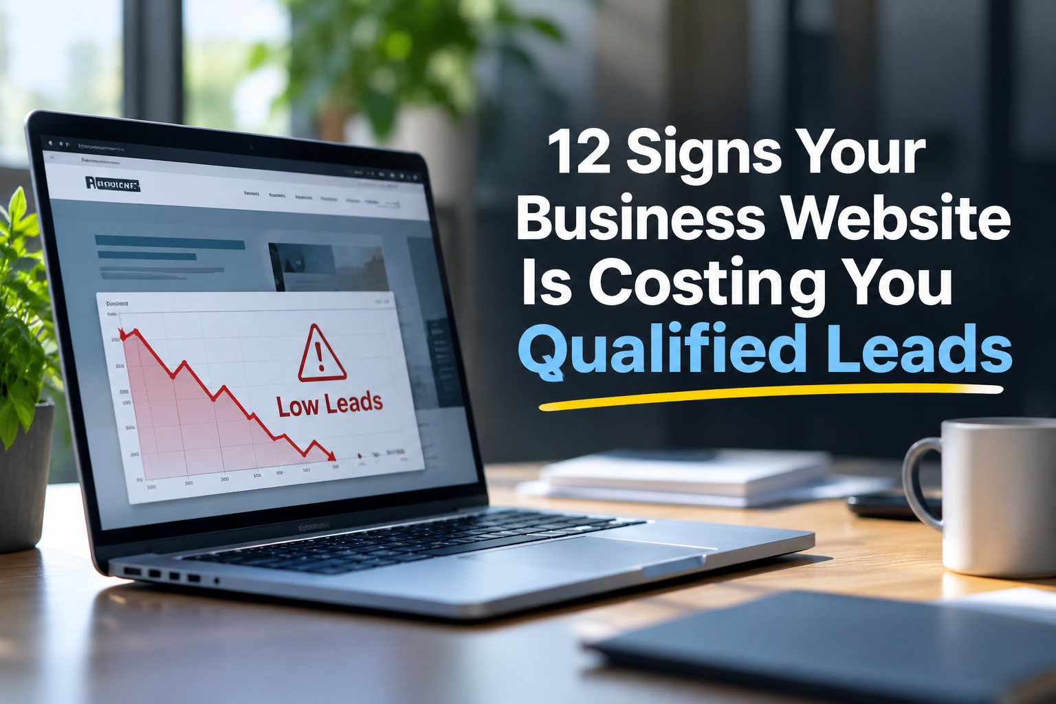
A business website can look polished and still quietly lose opportunities. The issue is not always traffic: it may be unclear positioning, weak trust signals, frustrating mobile experiences, or forms that fail to turn interest into a useful conversation. Here are twelve warning signs to investigate before spending more on advertising or commissioning a redesign.
1. Visitors arrive, but qualified inquiries stay flat
Compare organic landing-page visits with meaningful actions such as consultation requests, quote submissions, and calls. If traffic grows while qualified leads do not, review whether the page answers the visitor’s actual buying question. Do not judge success by pageviews alone.
2. Your headline describes your company, not the customer’s problem
“Welcome to our website” gives buyers little reason to continue. A useful headline identifies the audience, the service, and the outcome without exaggerated promises. Ask a new visitor to explain what you do after five seconds on the page.
3. The next step is hard to find
Visitors should know whether to request a quote, schedule a conversation, or explore relevant work. Check the primary call to action on desktop and mobile. Too many competing buttons can be as confusing as none.
4. Mobile visitors struggle to complete basic tasks
Test navigation, tap targets, form fields, text readability, and page speed on a real phone. A desktop-perfect design does not guarantee a usable mobile experience. Try submitting your own inquiry without zooming or switching devices.
5. Your portfolio does not demonstrate relevant outcomes
Beautiful images matter, but prospective clients also want context: the challenge, the approach, and the result. Where permission allows, explain what was created, who it served, and what improved. Never invent performance metrics.
6. Your contact form asks too much—or too little
A long questionnaire can deter early-stage prospects; a form that only requests a name and email may not provide enough information to qualify the inquiry. Ask for the minimum details needed to respond intelligently, and explain what happens after submission.
7. Buyers cannot tell who you are best suited to help
Generic claims like “solutions for everyone” make comparison difficult. Clearly describe your ideal clients, typical project types, and any relevant industries. Specificity can improve lead quality even if it reduces unqualified inquiries.
8. Service pages sound interchangeable
Each service should have its own audience questions, deliverables, process, and next step. If swapping page titles leaves the body copy equally applicable, the content may not give searchers enough reason to choose that page.
9. Trust signals are missing near decision points
Relevant testimonials, authentic case studies, team expertise, clear contact information, and straightforward policies can reduce uncertainty. Place proof near the claims it supports; avoid anonymous endorsements or unsupported superlatives.
10. Visitors repeatedly abandon high-intent pages
Use analytics and, where appropriate and consented to, behavioral tools to examine the journey from a service page to contact. A high exit rate alone does not prove failure; interpret it alongside engagement, device, traffic source, and conversion data.
11. Your website does not explain your process
Buyers may hesitate when they cannot picture the next steps. Briefly outline discovery, proposal, production, review, and launch—or the stages that accurately reflect your business. Clarity about timelines and responsibilities helps visitors decide whether to inquire.
12. You cannot identify which pages generate actual opportunities
Set up meaningful conversion events and connect inquiries to their landing pages and channels where practical. Distinguish raw submissions from qualified conversations and signed projects. Without measurement, redesign decisions become guesses.
A practical 30-minute website lead-loss audit
- Five minutes: Open your homepage and top service page on a phone. Can a stranger explain your offer and find the next step?
- Five minutes: Submit a test inquiry. Confirm the form works, the confirmation is clear, and the message reaches the intended inbox.
- Ten minutes: Review your highest-traffic landing pages alongside qualified inquiry data. Note where traffic and results diverge.
- Five minutes: Inspect two relevant case studies or testimonials for credibility and context.
- Five minutes: Prioritize one friction point, one messaging problem, and one measurement gap to investigate.
Should you optimize or redesign?
If the site has a clear structure and reliable technology, targeted improvements to messaging, calls to action, forms, and proof may be enough. A larger redesign may be appropriate when the information architecture, mobile usability, content system, or brand positioning no longer supports the business. Start with evidence rather than assuming a new visual style will solve a conversion problem.
Turn your website into a better qualification tool
The goal is not to collect the most inquiries; it is to help the right buyers understand your value and start productive conversations. Sublime 360 Media approaches bespoke website design and development as a combination of visual communication, usability, and business needs. If your site shows several of these warning signs, document the issues first and use them to guide a focused discussion about next steps.
 Ready to get your free website audit?
Let’s co-create something magnetic. Book a free discovery call today